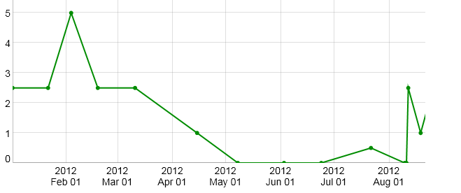
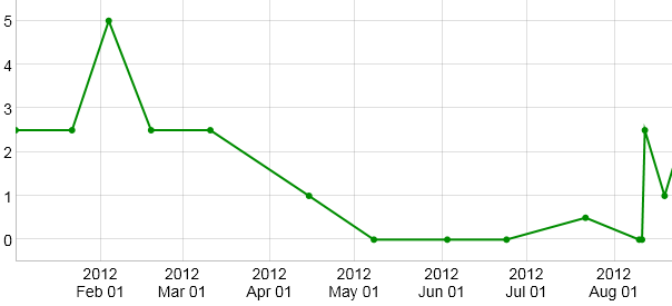
Chart Options

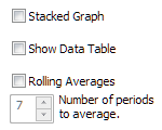
Stacked Graph
If checked, totals all the graphs by stacking them one on top of another.
Show Data Table
If checked, displays the Chart's data values in a table below the graph.
Rolling Averages
If checked, converts values to rolling (moving) averages. Rolling averages are used to smooth out short-term fluctuations and highlight longer-term trends.
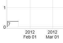
Rolling Average Displayed in Lower Left Corner of Chart
Note: Rolling averages are not the same as Daily, Weekly or Monthly averages available from the Activities Picker.
|

Series Options apply to individual Activities, rather than the Chart as a whole.
Line Style or Icon
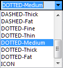
Choose a style for the line to be graphed, or ICON to draw icons at the bottom of the chart instead. Icons can be helpful to indicate when Activities such as that don't have me
Color
The color selected is the one defined for an Activity by its Activity Definition. You can change the color here, if you wish. However, this will redefine the color for the Activity in the Activity Definition.
Fill Graph
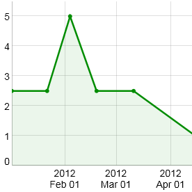
Fill Graph shades the area below the plotted line.
Step Plot
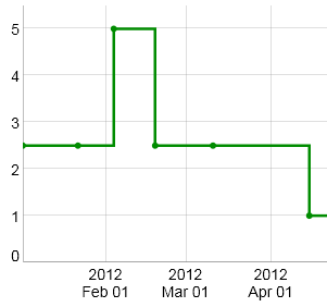
Line graphs assume that data is continuous, so a straight line is drawn between adjacent data vales. The line is an interpolation between the data points. Line graphs are a good choice for graphing measurements of water parameters. If the level of calcium you measure changes from 390 ppm to 380 ppm, a line graph makes the assumption that an amount of calcium was consumed continuously and uniformly between the two measurement dates. This is not an unreasonable assumption, as calcium is continuously consumed by organisms in the aquarium.
A Step Plot is used to graph data that is not continuous in nature. A good example of this is dosing additives, such as calcium. Unless you're using a calcium reactor, the dosing is not happening on a continuous basis. Perhaps you dose calcium every several days. In this case, a Step Plot is a better choice.
Show Data Points
If checked, indicates where on the line values are plotted.
Trend Line
If checked, calculates a trend line (a linear regression) through the data values.
Average Line
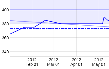
If checked, plots the average value for the data series. The average is always plotted as a horizontal line with a dash-dot dash-dot line style:
Water Parameter Target
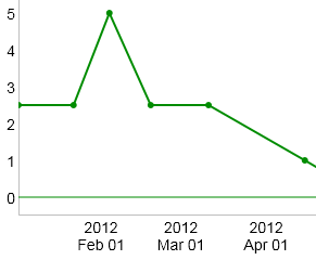
Applies to measurement type Activities. If checked, draws a solid horizontal line at the value chosen as a Target Value in the Activity Definition.
Water Parameter Range

Applies to measurement type Activities. If checked, a shaded area is displayed on the graph to indicate the acceptable range of values set by the Minimum and Maximum in the Activity Definition.
|


