Chart

|
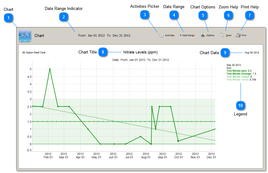
Activities that you record in the Activities Register can be plotted in Charts. Charts plot each Activity as a time series. For measurements, you can also plot the associated target value, acceptable min/max range, average, and trend line.
Charts makes it easier to understand when Activities were performed, to spot trends in an Activity’s values, and to help make inferences among Activities.
BlueChromis Charts are fully interactive. The Legend dynamically changes as you mouseover data points. You can Zoom in to see more detail when large amounts of data are plotted. Changes to Chart Options happen instantly in real time.
A unique feature of BlueChromis is the ability to plot any Activity, not just measurements.
|
|
The Activities Picker is used to select what Activities to include in the Chart. You also set the data resolution here.
|
|
Opens the Chart Options window. Changes to graphing options happen immediately in real time.
|
|
Print the contents of the Analysis.
|


