15 Day Free Trial

One of the ways we become better Aquarists is to discover trends, and to learn cause and effect, from the recordkeeping we do. Analysis using Charts and tabular data is an excellent way to help us do that.
Books and online materials can inform us about general aquarium keeping. However, each aquarium is a unique ecosystem. Understanding trends and relationships for your specific aquarium is important.
Analyzing aquarium data also helps to develop better schedules for aquarium maintenance.
BlueChromis provides both Graphical and Tabular Analysis of your Activities. Technically, both types of analysis are called time series analysis.
BlueChromis charts are designed for high volume scientific applications, so you won’t find any data limitations. There is no limit on the amount of data you can plot. You may plot as many data series as you wish.
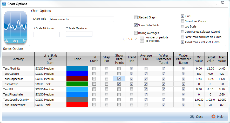
BlueChromis charts are fully interactive. You can zoom in to see more detail. Data values display as you mouse over a data plot. Option changes are instantly reflected in the chart.
With BlueChromis you can graph measurements and any other data you choose. Each measurement or activity is plotted as a time series. A time series consists of values plotted at successive points of time.
![]()
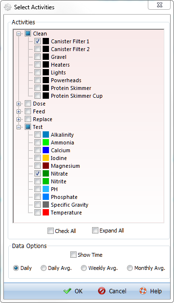
Activities Picker
Most other aquarium management software only allow you to plot measurements.
So why would you want to plot something other than the water parameters you test? Well, look at the chart above. It plots nitrate levels and shows how often the aquarium’s canister filter is cleaned. We want to keep nitrate levels as low as possible. Notice that cleaning the filter more frequently (Feb 2012 to Apr 2012 and Aug 2012 to Sept 2012) helps bring down the nitrate levels. When we cleaned it less frequently (May 2012 to Jul 2012 and Oct/Nov 2012), nitrate levels start to increase. This type of analysis might help you fine tune how often you must clean your filter. It’s just one example of many.
A tabular view of data presents each activity as a time series that occupies one column in the table. This makes it easier to understand exactly at what dates an activity was performed, to spot trends in an activity’s data and to make comparisons between activities.

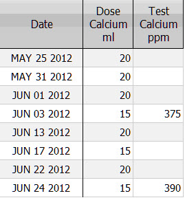
Analyzing Dosing Calcium on Calcium Levels